


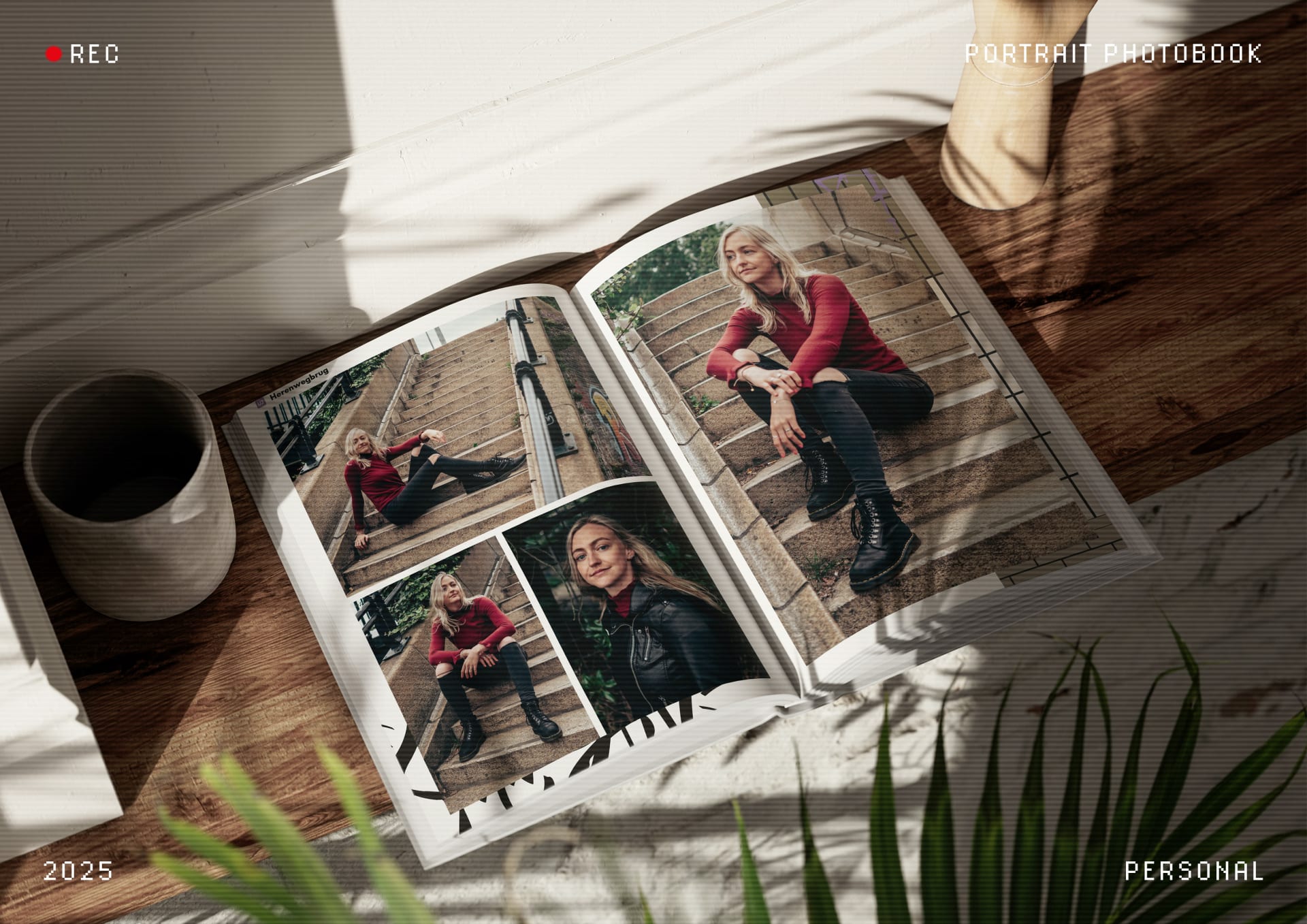
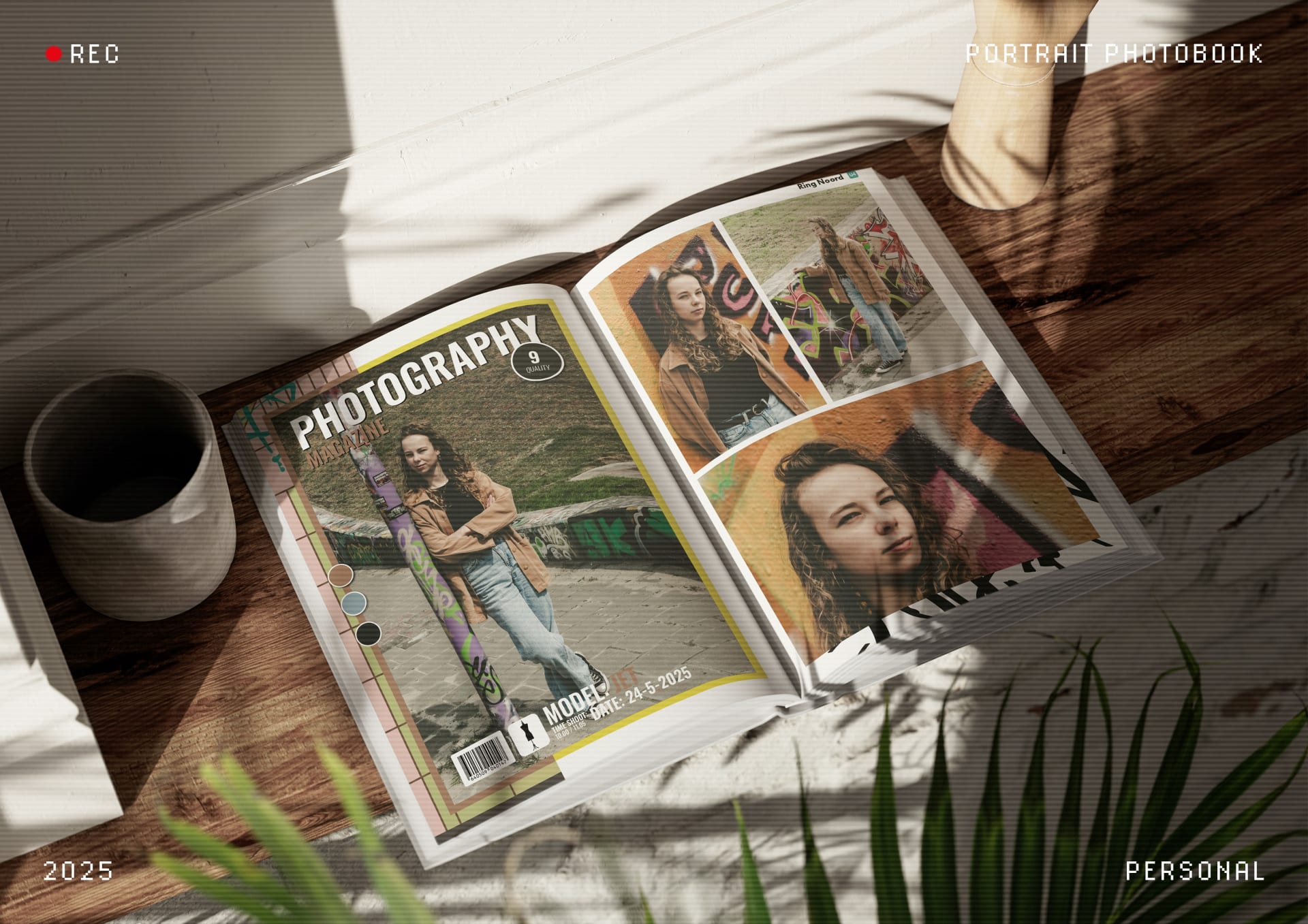
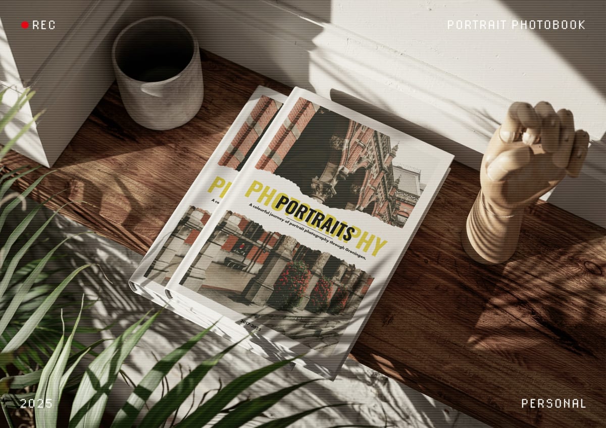


I designed this photobook with the goal of creating a single book that showcases all the portrait photoshoots I shot between 2017 and 2025 in and around Groningen. To reflect on the many cool and wonderful shoots I've done in Groningen, I decided to compile a curated selection of the best photos from each session into one single photobook. This collection serves as both a personal archive and a creative reference for future projects.
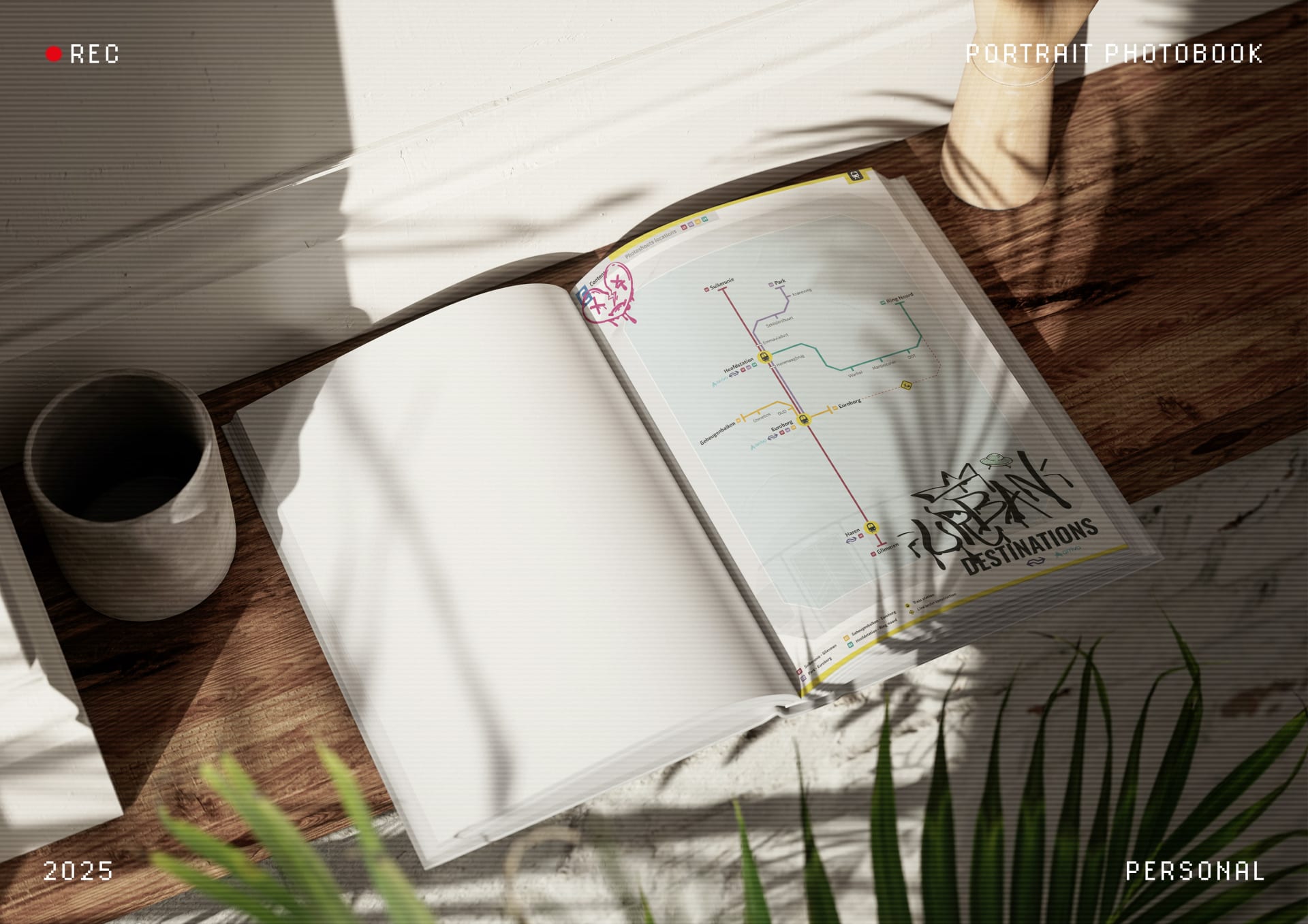
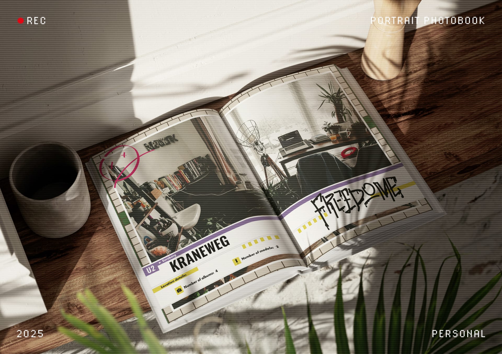
The book’s design is centered around two main themes. The first is the urban style that defines much of my photography: gritty city scenes, graffiti, and raw, street-inspired visuals. I incorporated these elements directly into the design through urban textures and motifs. The second theme builds on this aesthetic by blending it with my appreciation for German architecture. To bring this to life and add a bit of organisation and structure to the design, I organized the book by location, highlighting places where I shot multiple sessions over the years.
Each section is styled to resemble a Berlin U-Bahn station. I recreated many station walls in Adobe Illustrator and used them as background elements for each location’s page/spread. To further develop the concept, I designed the table of contents as a metro map, inspired by the layout of Berlin’s public transport system map. Chapter headers were styled to match the signage used in Berlin’s U-bahn stations, adding a consistent and immersive visual identity throughout the book.